

Luminare
-
Posts
3,960 -
Joined
-
Last visited
-
Days Won
12
Content Type
Profiles
Forums
Events
Posts posted by Luminare
-
-
My guess is that it's a temporary stop until the line extends westward.
-
I will also say I am not a big fan of the Perot. The building feels significantly smaller on the inside than it appears on the exterior.
It was a very difficult site and program they had to develop.
I would give this a watch:
It talks about their process for the Perot Museum. Very interesting. I was actually at this Lecture while at A&M.
I wonder if there is a video of Steven Holl (or one of his associates) talking about a recent building he did as to get more of an idea of how his practice designs buildings. I'll have to find one later.
-
Serve both B/CS and Huntsville. It would be a smart move politically and save the headache of going through Huntsville or Bryan/College Station. Those areas would be better served by passenger rail anyway. It's also not exactly a new idea placing HSR stations in rural areas. If you want to reach smaller cities while still compromising between them then put it in the country and have either bus systems or maybe in the future passenger rail can connect both small cities/towns and it connects with HSR.
-
Luminare, I know what an orthogonal grid is. I was sarcastically trying to point out your error but as it has many times before, sarcasm doesn't translate well through text.
Anyway I think they chose the right architect for the project. All three of those are some of my favorite firms and do great design work. The Snohetta entry in this case was uninspiring to me. I love nearly everything Morphosis designs but I wasn't crazy about this one. The scale almost seemed too small for them and the work they've done recently. I think it also came down to the way the building was presented in the renderings..very conceptual and faint. Their plans and sections, because of the way they design, were probably a little hard to read for people not used to looking at them.
I think Holl has the right balance of conceptual and at the same time presenting something that 'looks' like a museum; the plans and sections posted of the building are very clear. At the end of the day though they couldn't have gone wrong with any of the three.
Well...sorry.
I all about sarcasm, but I really didn't get any hit of sarcasm from your post especially since it was your very first post...
You clearly know what you are talking about. As long as it didn't come off as me talking down to you then ok.
I personally am a fan of Morphosis so after seeing their idea for the Museum I would have loved their design. In response to Texasota if you look at the renderings and have looked into Morphosis other works they are very minimalistic in their approach to presentation layouts.
The Steven Holl design is a better fit for the way Houston is right now and I think Morphosis is a kind of architecture I hope becomes more the norm in Houston 5-10 years down the road.
-
 1
1
-
-
Oh wow! That's pretty recent. Now If he is even thinking about making a mid-way stop I think we can get a little more comfortable about it going from Downtown to Downtown.
-
@Montrose I think you hit the nail right on the head. It's the medium of the two extremes that flank it.
Due to my current architectural sensibilities I would have gone with Morphosis. The digital revolution in architecture is upon us and Morphosis is one of the firms leading the way in the US. They really challenge how we perceive form and space and the geometry they create is quite radical for american architecture. What is great about Morphosis is they live and breath the Process. You can see that in their diagrams as they layout each step in how the building was forged or crafted into the shape you see. There is a logic about their work that gives justification to every design decision. There was another thread about that one lab building going in at the St. Thomas campus and the disappearance of the canopy. With a Morphosis design they always get exactly what they want because each element is integral to the whole. Another element which can be seen in the sections and renderings is the "big move". They do a lot of civil and art buildings and they understand that most of the building has to be dedicated to program and so they will assemble the building together and then put a large amount of design attention to a particular area of the building that is the WOW part. The one gives the building its character and uniqueness.
@H-Town Man I understand the sensibility for buildings to be a little more subtle or even passive in regards to forming space, but in a city so spaced out devoid of a lot of crafted/intimate spaces I think it's essential for buildings in our context to form or direct people to certain spaces or places. Some buildings do it more than others, but a great building is able to create a new environment within itself and create views to the outside which weren't noticeable before.
-
1
-
-
Great lecture...never heard of an "orthagonal" grid before.
The three finalists were Holl, Snohetta and Morphosis
Here's a link to the Morphosis design: http://morphopedia.com/projects/museum-of-fine-arts-houston
Glad you liked the conversation.
Orthogonal (we both misspelled it lol) is thrown around a lot in Architecture. In laymen terms its something that is linear and so an orthogonal grid is a linear grid. Most often its a grid of squares or rectangles, but can be more than that. Frank Lloyd Wright did all kinds of crazy grids from triangles to hexagons, as an example.
MORPHOSIS!!!!! UGH. Now I want that design
 They just recently finished a new Museum (The Perot Museum) in Dallas! Oh well......I'll still take Steven Holl >.<
-
1
-
-
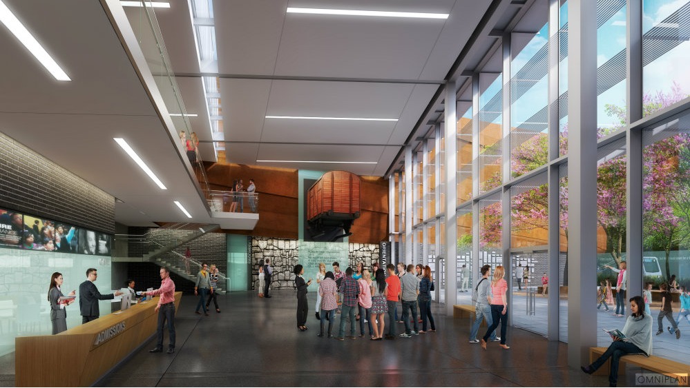
New Dallas Holocaust Museum by Omniplan Architects
http://www.archdaily.com/588937/a-first-look-at-omniplan-s-proposed-dallas-holocaust-museum/
-
2
-
-
Unless they put out a press release stating that they won't then it's assumed that they would.
-
Ah, I see. Well, if that's the case, I seem to remember that in the master 290 plan, the Hempstead Tollway would be built between the railroad and the original Hempstead Road with a high capacity transit corridor nearby taking up more ROW (and requiring demolition). In the 290/610 rebuild, TxDOT had to settle because some more ROW was taken than necessary...for the HCTC.
They have since ditched the separate tollway and it will now run with the rest of 290.
-
The one we have been discussing was the path along Hempstead Hwy
-
....and a lot of sod was replaced that day
-
Urbannizer, Do we know about the full roster of firms who were finalist or a group that were all considered?
-
To be perfectly honest, while the canopy element was a neat piece it definitely wasn't going to be something you could defend easily in this design. I don't see the actual use of it other than some designer thought it was cool. Once again its a cool feature and its interesting, but I'm 100% sure either the structural engineer or client when questioning the architect on why it needed to be in the project whoever was the designer didn't have more than one reason to keep it or make it feasible and so it was axed. One of the biggest lessons I got from architecture studio and subsequent reading is that if you don't have at least two reasons why you made a design decision then chances are that it isn't going to survive in the project. Every element in a design should have some sort of purpose and even if it's purely architectural/artsy it still can impact the design in more than one way to justify it being included because at the end of the day you are playing with millions of dollars and when stuff gets cut out of a project (which it does for almost every project even for starchitects!) if all you can say to keep is because "well I thought it looked cool"....it's going into the garbage bin!
-
The reason why rail works in other places is because of ease of use and its inter-connectivity to other systems. Everyone freakin gets caught up with this density crap! That's not what necessarily makes rail successful and its a big reason why people don't think we need it. Its how a particular system gets you from point A to point B. If you only build your system to get from point A to point Aa then it won't be very desirable and would be used less. The future of transportation is multiplicity and not exclusivity which is the biggest hindrance upon American transportation systems. I think people assume that these systems are suppose to have legs on their own and when one fails we are all the sudden surprised that it fails or one doesn't get the amount of ridership it should. When highways pile up because its the only way to get around we all are baffled as to why. This is why I think it's foolish to imagine a world without the automobile because it plays a key part in a transportation ecosystem. Each services different needs, but when you only have ONE style of transport trying to service ALL needs efficiently then it collapses under its own weight and I don't understand why this is so hard to understand. Screw density because it's merely a component to a greater argument where the foundations of our current transportation network are built on a failed logic of exclusivity of use.
-
2
-
-
Since this is a private project they do not have the power of eminent domain so their arguments are mute which is why I said in an earlier post they are really only doing these meetings to save face and probably because it's a federal condition. In the US, private property almost always circumvent the concerns of neighbors unless it would be dangerous to others or have a negative environmental impact and with the biggest selling point being that Trains are more environmentally friendly with a massive amount of evidence to back that fact up all of these NIMBY's would have little to zero chance in court in preventing this from happening if only doing so to delay construction as long as possible. Even that though would be swiftly thrown aside. Doing HSR as a private venture is actually a stroke of genius and because of this it should be able to get over hurdles that would otherwise plague a government run operation.
-
1
-
-
I love the MFAH, and part of the reason is that it really is one of the least "Mies-y" Mies buildings. It's not built on an orthagonal grid; it partially obscures its structure from the street; it's actually pretty sectionally dynamic. It's ultimately distinct and specific to its site in a way that makes it more than just another Mies building.
I can understand how at first glance the fact that it is fan shaped would mean that it wasn't built on an orthagonal grid, but this just isn't the case. It wouldn't be very Miesian if it wasn't designed with a grid in mind (as are most modern architecture). A key feature in almost all modernist architecture is the strict adherence to a grid system however, and wherever the system is derived from. In this case it isn't a simple orthagonal grid, but instead it's a radial grid emanating from a distant point just like you would do if you were setting up a drawing in 2-point perspective. Miesian architecture is creating the grid, executing architecture within that grid and populating it with forms and space to create rooms or program. In this case the radial grid was first created and then all the spaces were placed onto the grid, but it still adheres to it.
You second point isn't exactly correct as well as the main structure of the building is fully exposed. The spine which runs long the roof of the building is fully exposed and runs from the very back, up the wall, over the roof, and then terminates down in front of the building. Sure it doesn't expose some of it's architecture like Philip Johnson's St. Thomas Campus, is one example, but it still reveals its structure to the public.
I will give you created for saying that it is sectionally dynamic! That is a very good way to describe it's interior architecturally.
Finally in countering your point about it being site specific, it only accomplishes this through it's exterior shape and nothing more, but it maintains it's International Style aesthetic meaning that theoretically this building could be grafted onto a similarly shaped building anywhere in the world and it would fit onto it.....though a bit awkwardly sure. The architecture though would be at home anywhere thus it being a clear example of International Style.
-
1
-
-
Anything infrastructure wise only becomes obsolete when it isn't able to perform its primary function such as being able to sufficient move traffic.
As far as failures bridges only due to structural design failure that doesn't take into accounts wind load, and load from passing cars or people. There are many examples of this where relatively new bridges either had complications or experienced complete failure due to failures in design. The biggest examples I immediately think about are the Tacoma Narrows Bridge in Washington where structural designs created the perfect storm of failure by not accounting for cross winds along the river combined with the bridge design being excessively light for a suspension bridge. The other major one I can think of is the Millennium Bridge in London. This was an interesting case because they did properly calculate for wind loads and designed the structure accordingly, but there wasn't enough people on the bridge at any given time to stabilize the bridge! They had to then go back and beef up the bridge and now it's perfectly safe.
Probably what kills most bridges (and all infrastructure for that matter) is bad maintenance, neglect, abandonment, or using the a bridge or infrastructure in ways where it wasn't intended to be used as such.
-
1
-
-
I was wondering how they formed the slanted columns. Very nice. They have a rectinlinear formwork, just like a typical column. Then the 4th side (the slanted side) they offset inwards (see the 2nd picture). Probably a through pin/pipe to set the angle.
Thanks for the pictures!
They would use the same formwork, but it would have additional bracing to get the angle for the slant. As far as maybe using different rebar or a particular type of concrete I do not know. I'm still learning about stuff like this. Would be better to ask a structural engineer
-
Wow the arrogance of that title....
-
I never said it was bad! Mies is Mies is Mies is Mies.
It may not be the IIT Architecture School - but its a fine building.
What the hell? I didn't say it was a bad building. I was simply giving it a critical analysis and no matter how much I like the building or any building it doesn't mean I can't be critical about it. Mies never designed bad architecture. His scale was from Super awesome to Simply Good. This is an example of Great and really demonstrates how distinct the International Style was and as some have said is very important that the city of Houston has such a fine example from that time period since at one point we were essential america's example of "The Modernist City".
Once again I really like the building, and now hopefully with this new building future directors will give the Mies Addition a second look into how it should be best utilized because instead of being a place that has passing collections it could be become a really distinctive location for a very particular collection of art which could give the building the attention it deserves.
-
I agree with Arche on that the Mies Addition by far not his best (this is coming from a guy who was able to experience the New National Gallery in Berlin one of his more praised buildings), but it's still a fine piece of architecture that like many of it's brethren is simply misunderstood by a current generation that run things today who simply can not appreciate it's simplicity and rigor in regards to form and space.
The building really plays with level changes and like many modernist buildings from Mies to Corb a big idea was progression through space which is very important in a museum and how you can make that interesting. Immediately when you walk into the main Foyer you see these level changes it beckons you to explore more of the space. Probably the most important aspect which has seems to have frustrated past curators is the verticality of it's interiors which makes filling up the space rather difficult. I imagine that the building wasn't really designed with rotating pieces in mind and more of a place to house selected permanent collections. Large modern art pieces that fill whole rooms and large canvas art would serve very well here.
Even though it isn't the best Mies building, like Arche said it's still better than most things that get built, period. What's even more interesting is that this building gets through into a much larger conversation about the value and worth of Modernist architecture and whether many are worth saving or should be put on the national register. That's for another thread.
@Cloud Museum directors honestly could care less whether they show their art in a multi-million dollar building or in a warehouse! Because at the end of the day the one thing that matters is the art and many past Directors have made the conclusion that the building robs the spotlight from the art.
-
I like how each picture is zooming in closer. Very dramatic...
-
1
-
-
Oh yeah look at that low quality Sketchup Model which was obviously switched to a line sketch style mode. Quickly cropped from a jpeg in photoshop and then oh lets put a plain green ground with a thrown in sky someone googled.
Yes ladies and gentlemen truely the mark of quality!
Expect the finished product to be the same...
-
3
-


Texas Children's Hospital Lester And Sue Smith Legacy Tower At 6651 South Main St.
in Texas Medical Center
Posted
Boring....very boring, and brown. Because those colors really motivate a child to get better -.-